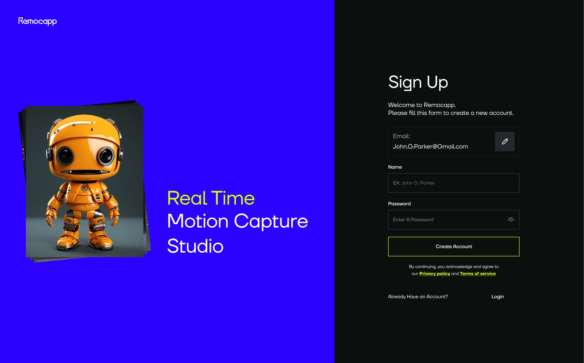
Real Time Motion
Capture Studio
Capture Studio
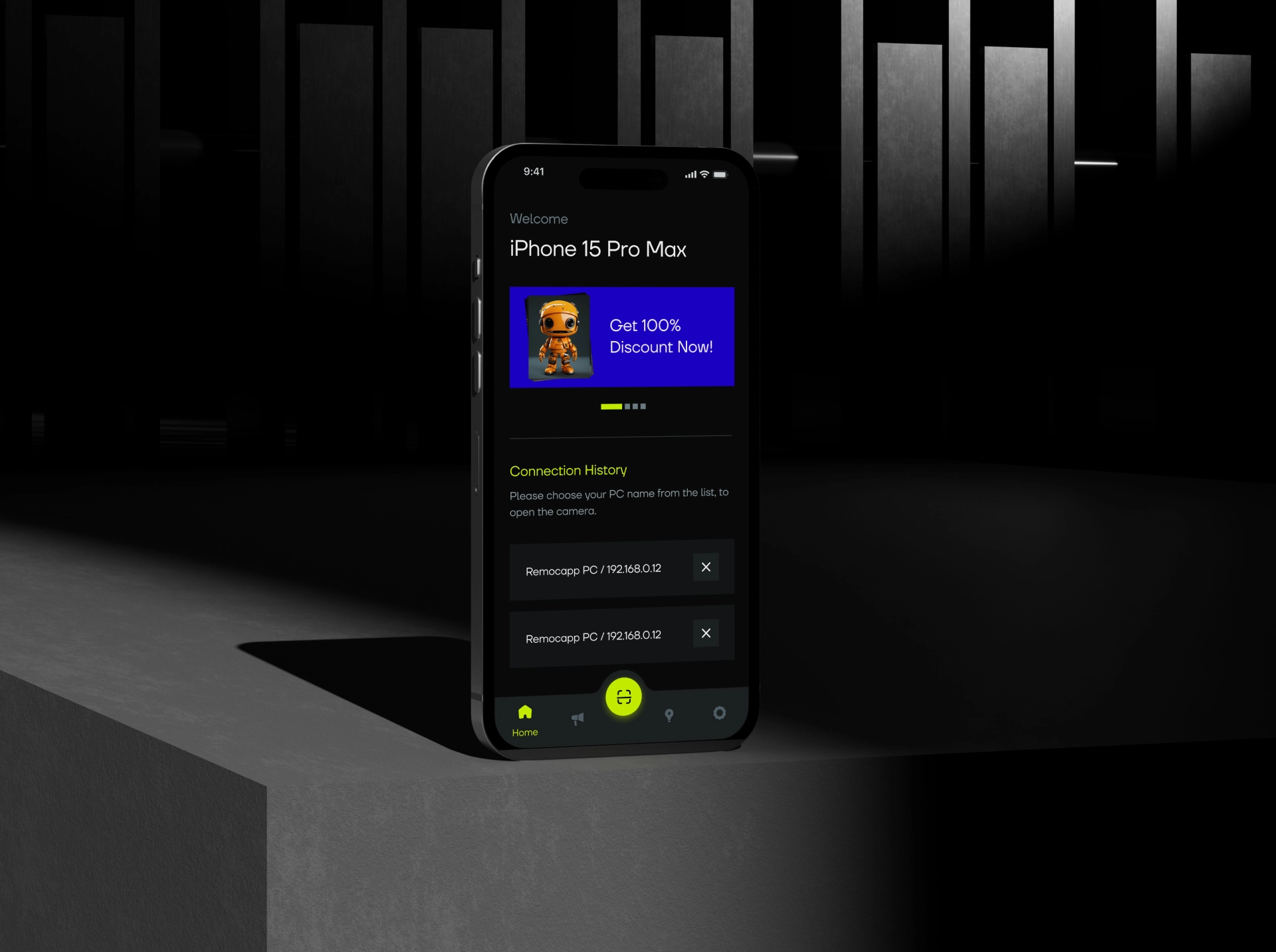
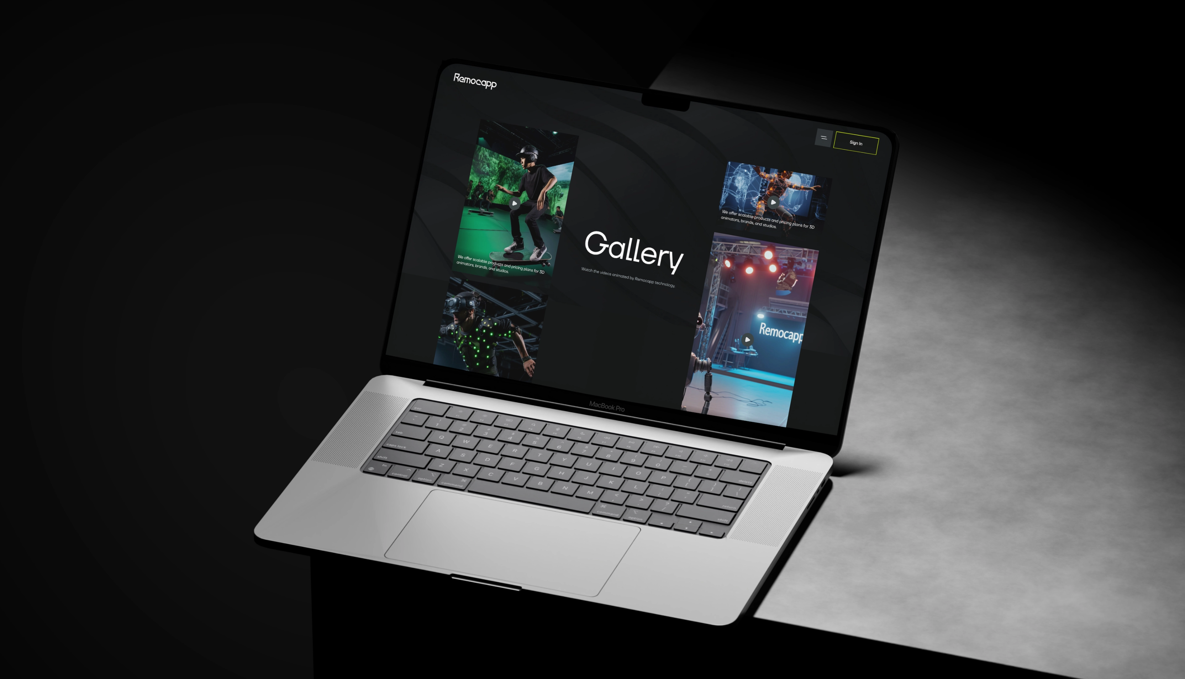
When Remocapp's board of directors scheduled their first meeting with Nibex, they needed to enhance their brand identity and create a cohesive product that would stick easily in the user's mind and provide ongoing support for the user experience.
Their product offers attractive services to their customers, but the appearance of their website could not properly convey this appeal to the user. Additionally, there was confusion and incoherence in their branding, both in tone and content, underscoring the need to rethink their visual identity as a starting point for a new branding initiative.
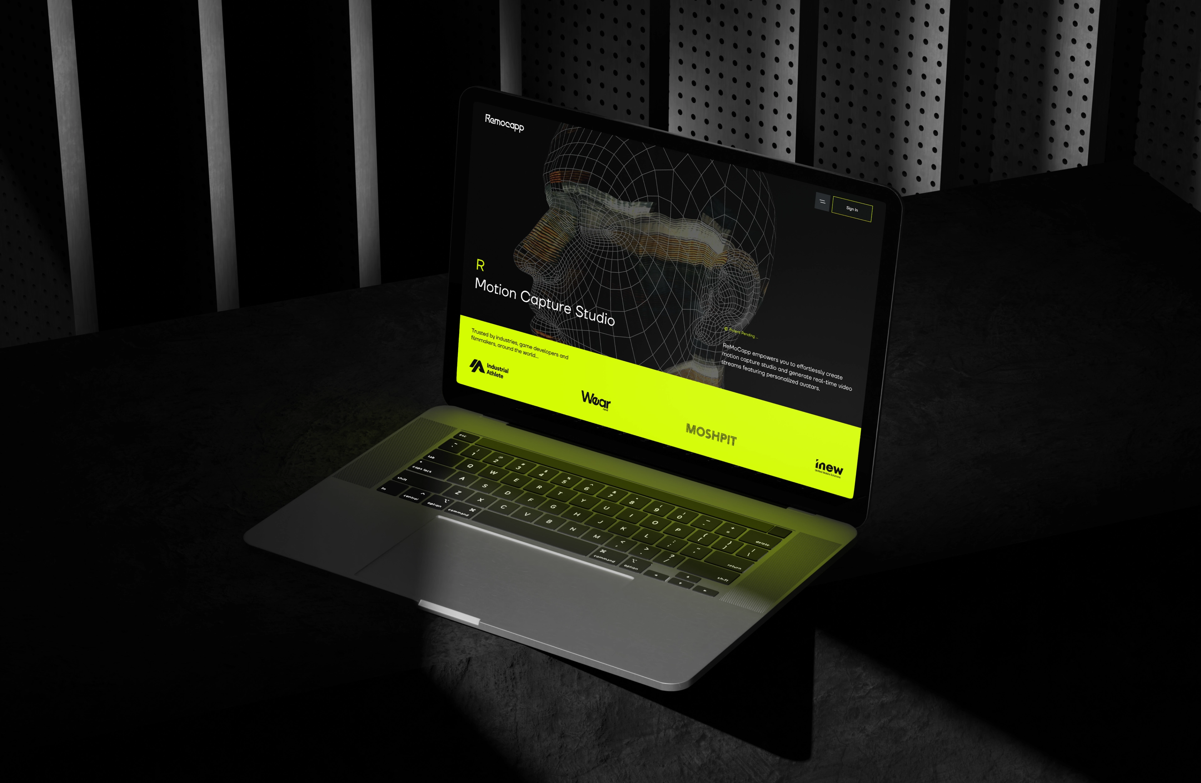
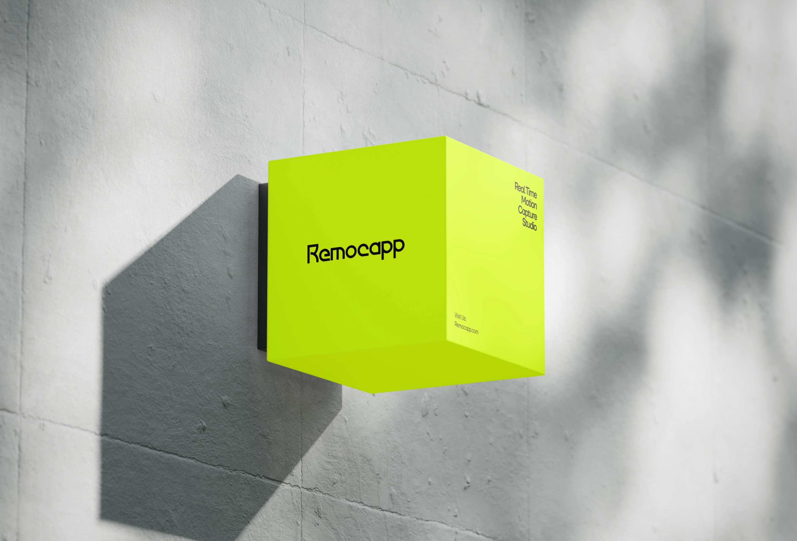
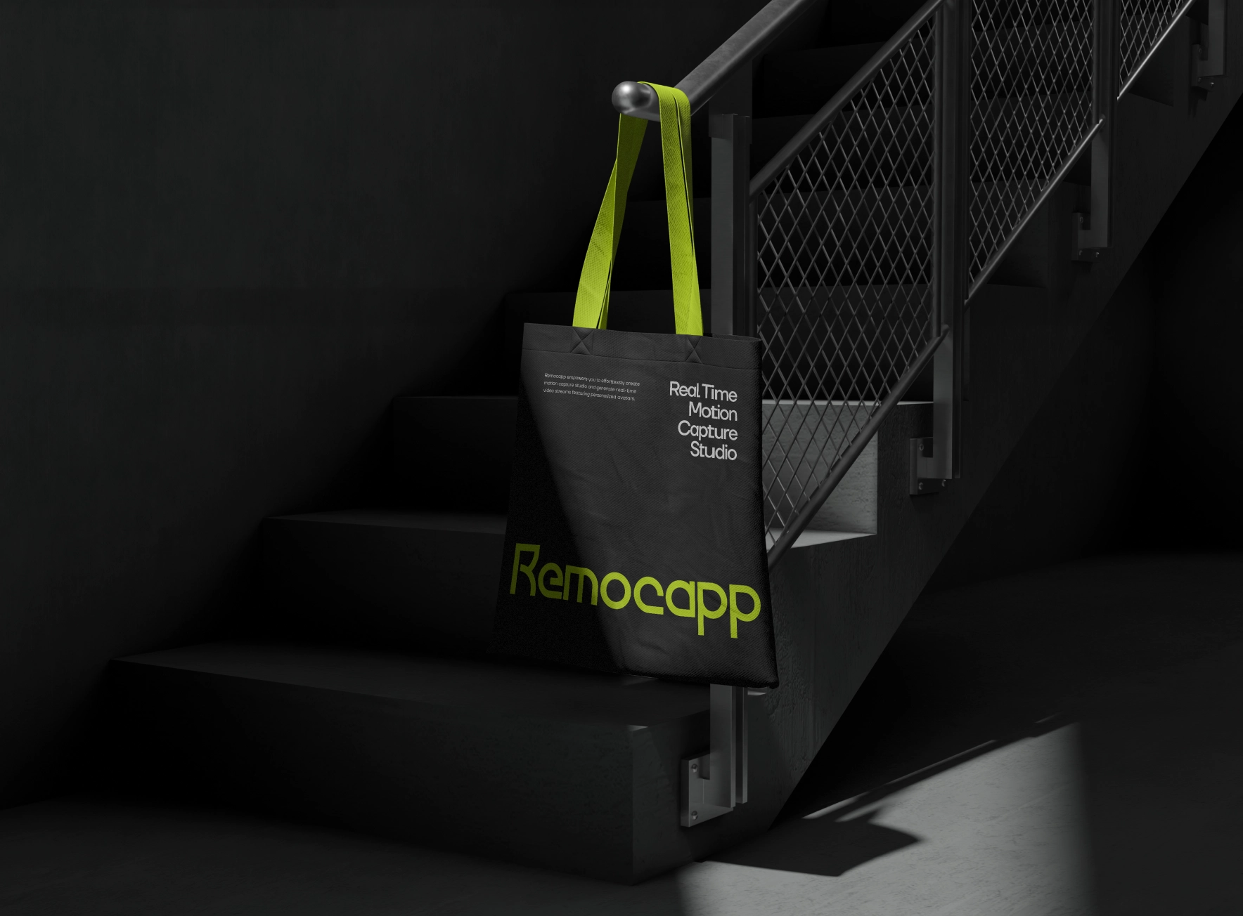
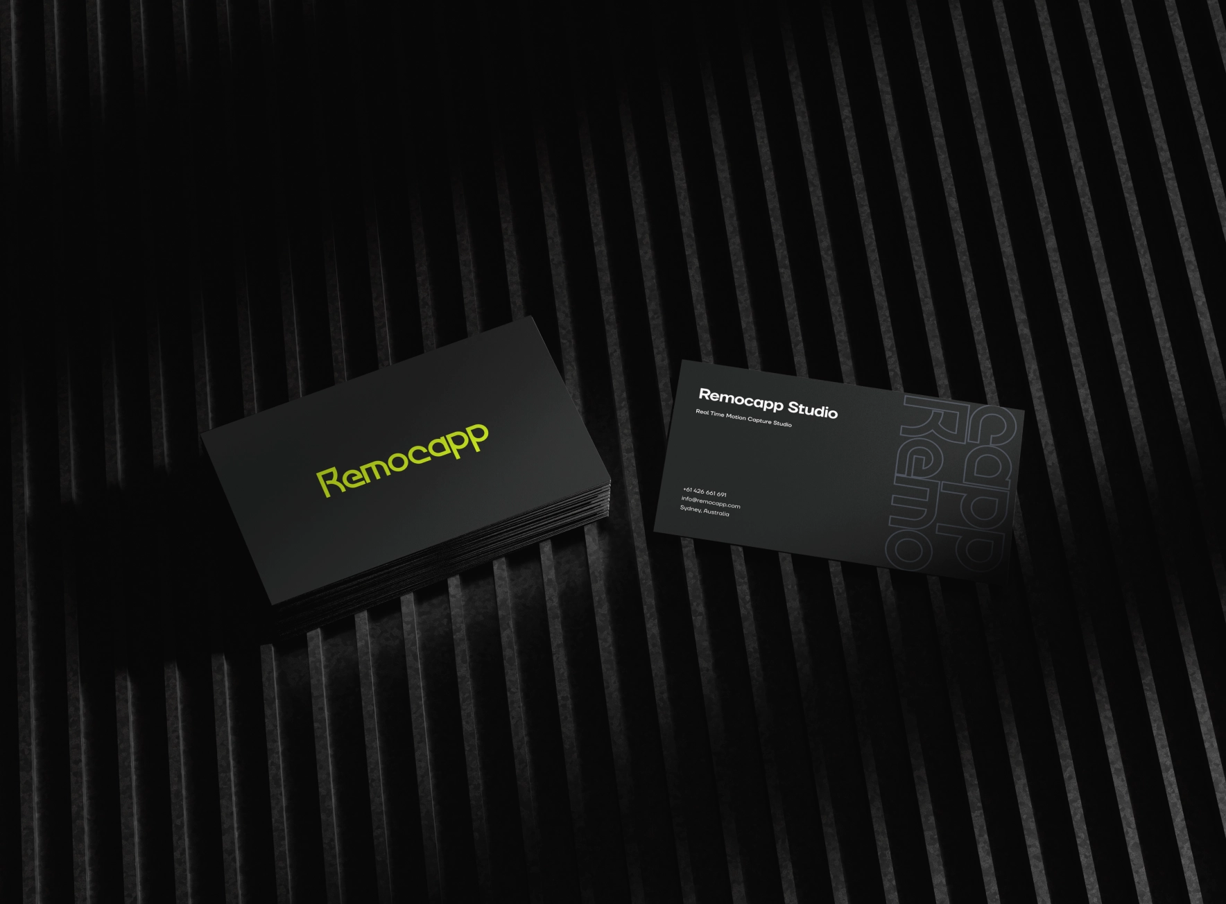
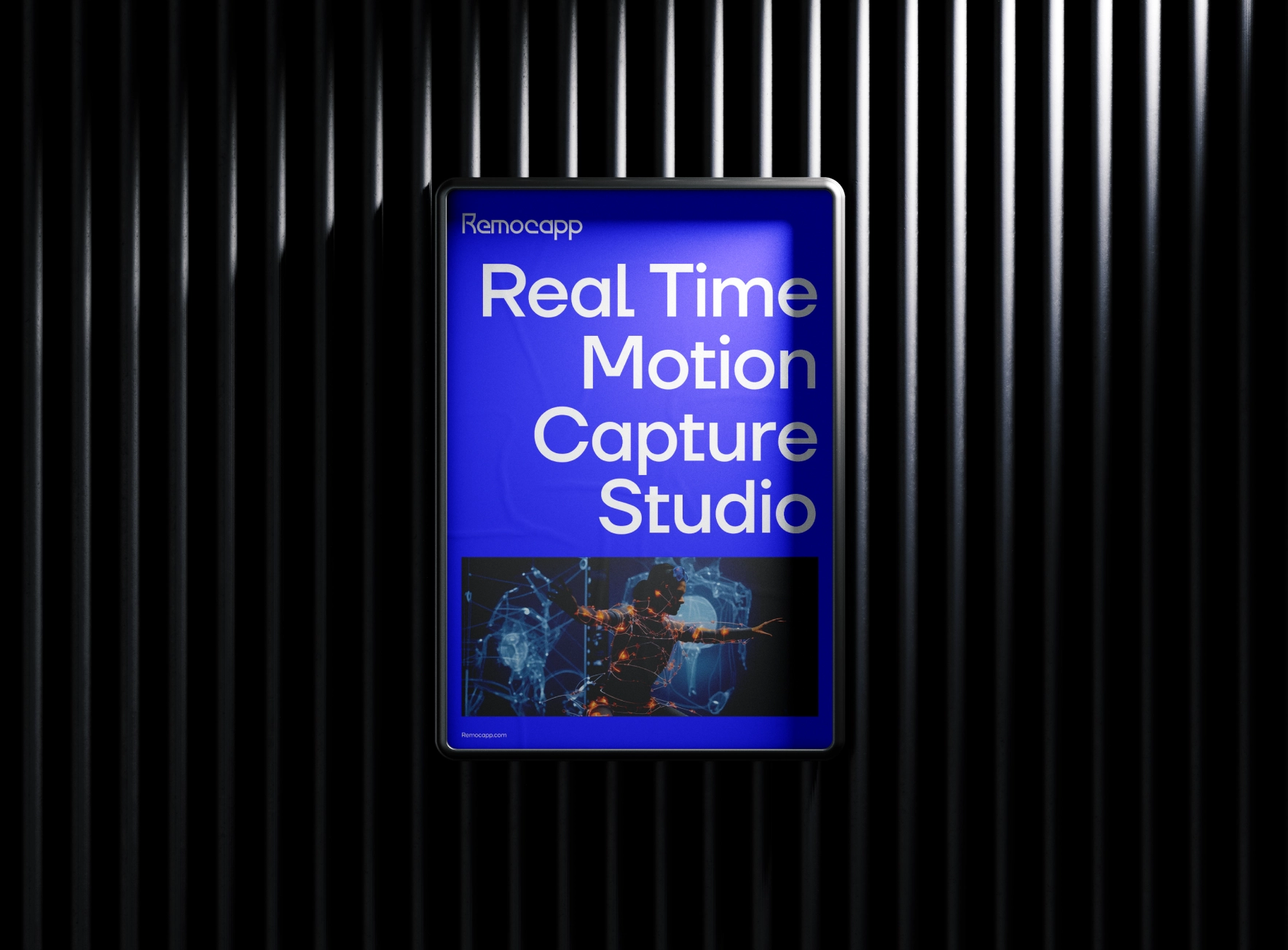
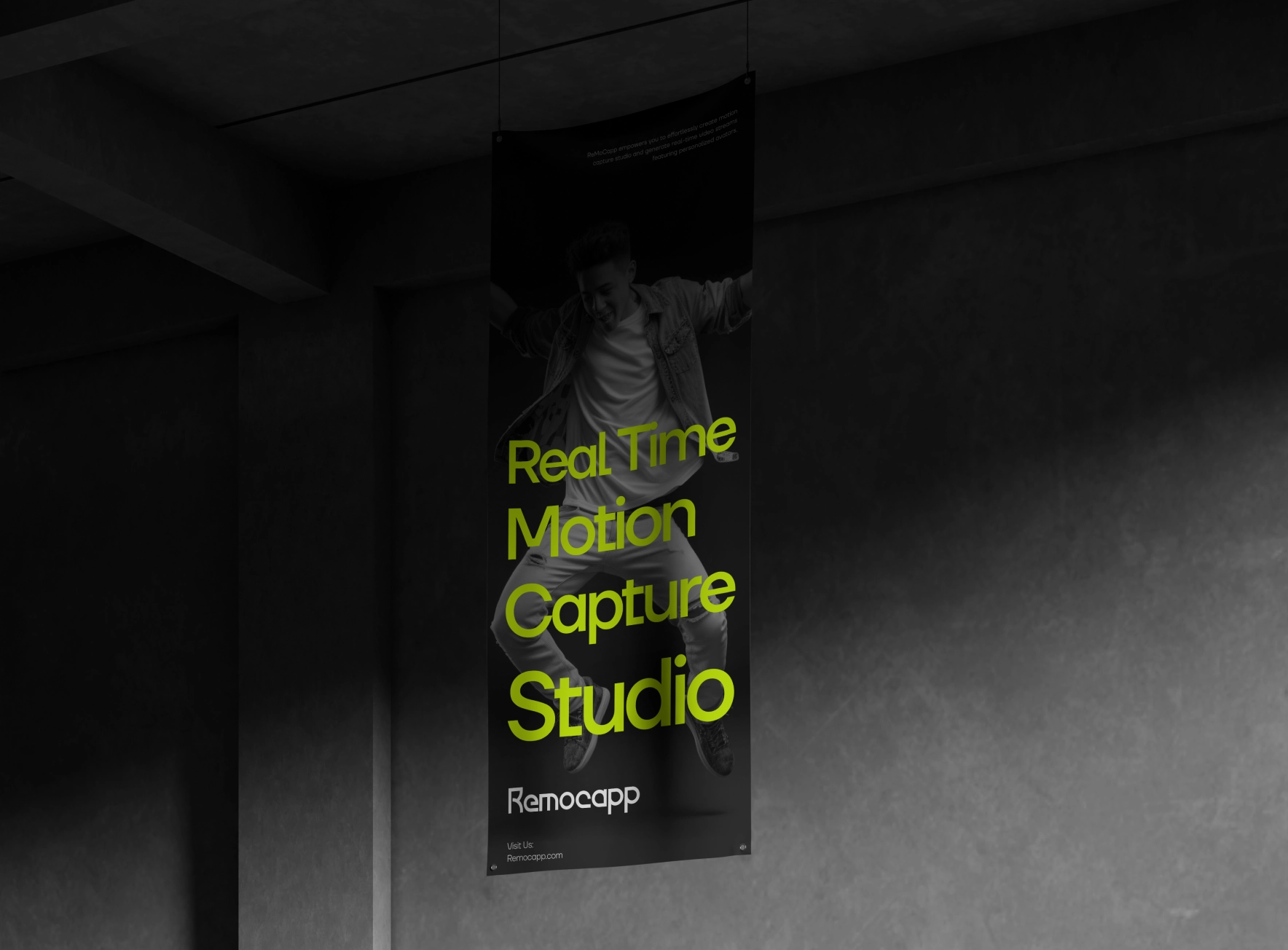
Once we became aware of the needs of this project, we initiated the workflow and began by redefining the brand identity. Initially, we redesigned the logo, opting for a simple yet distinct logotype with a unique form and style. We then aligned the color palette and typography system with the brand's objectives.



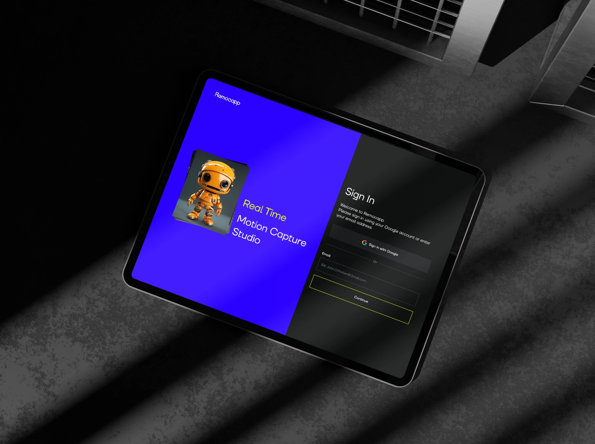
Once we completed the visual identity redesign of the brand, based on our schedule, we first tackled improving user experience issues. Particularly, the user dashboard required special redesign in the user experience.
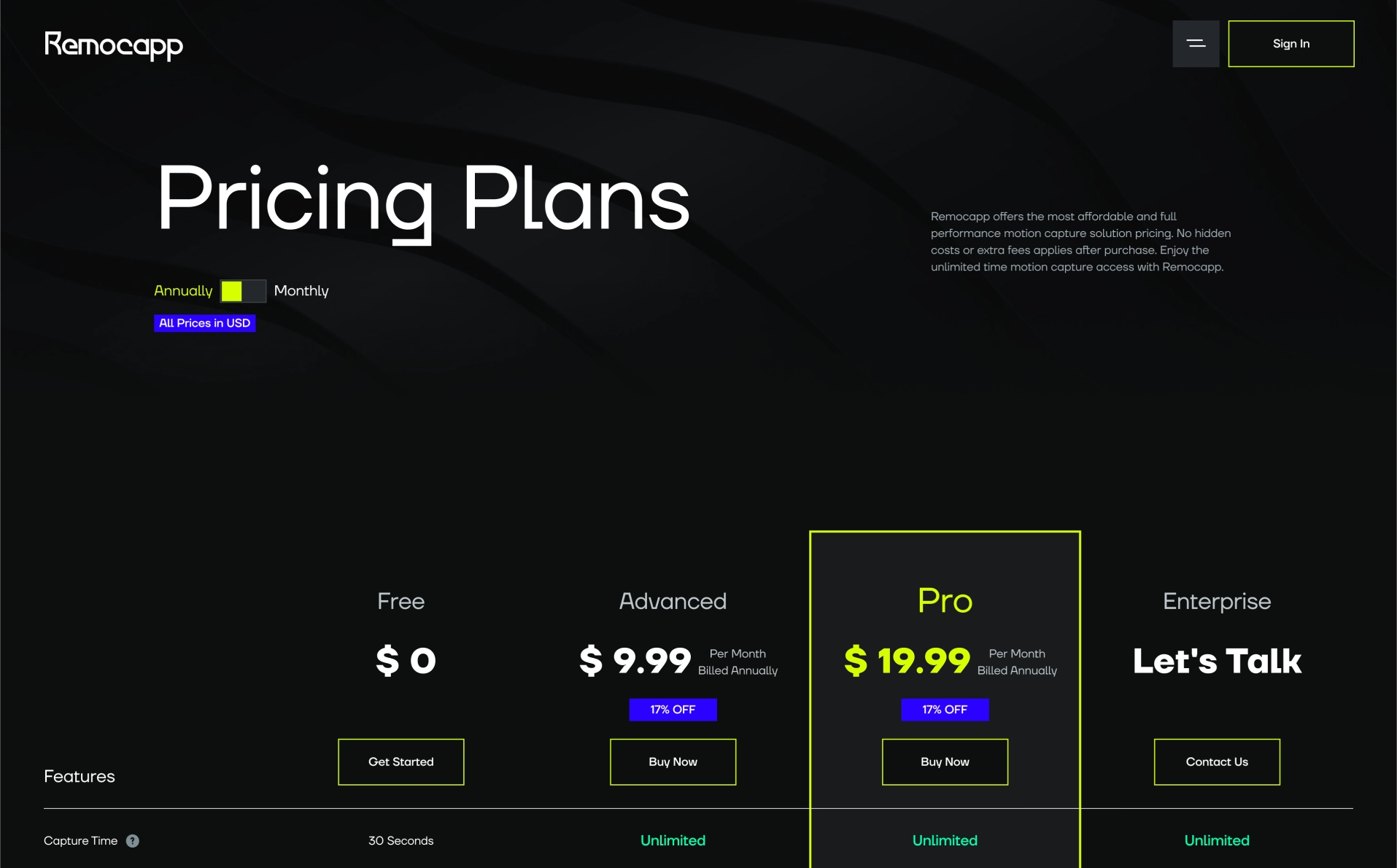
All processes became simpler, user paths were shortened, eliminating the need for users to navigate complex and tiring paths for subscription purchases. Instead, these paths were replaced with more common and familiar ones for users.
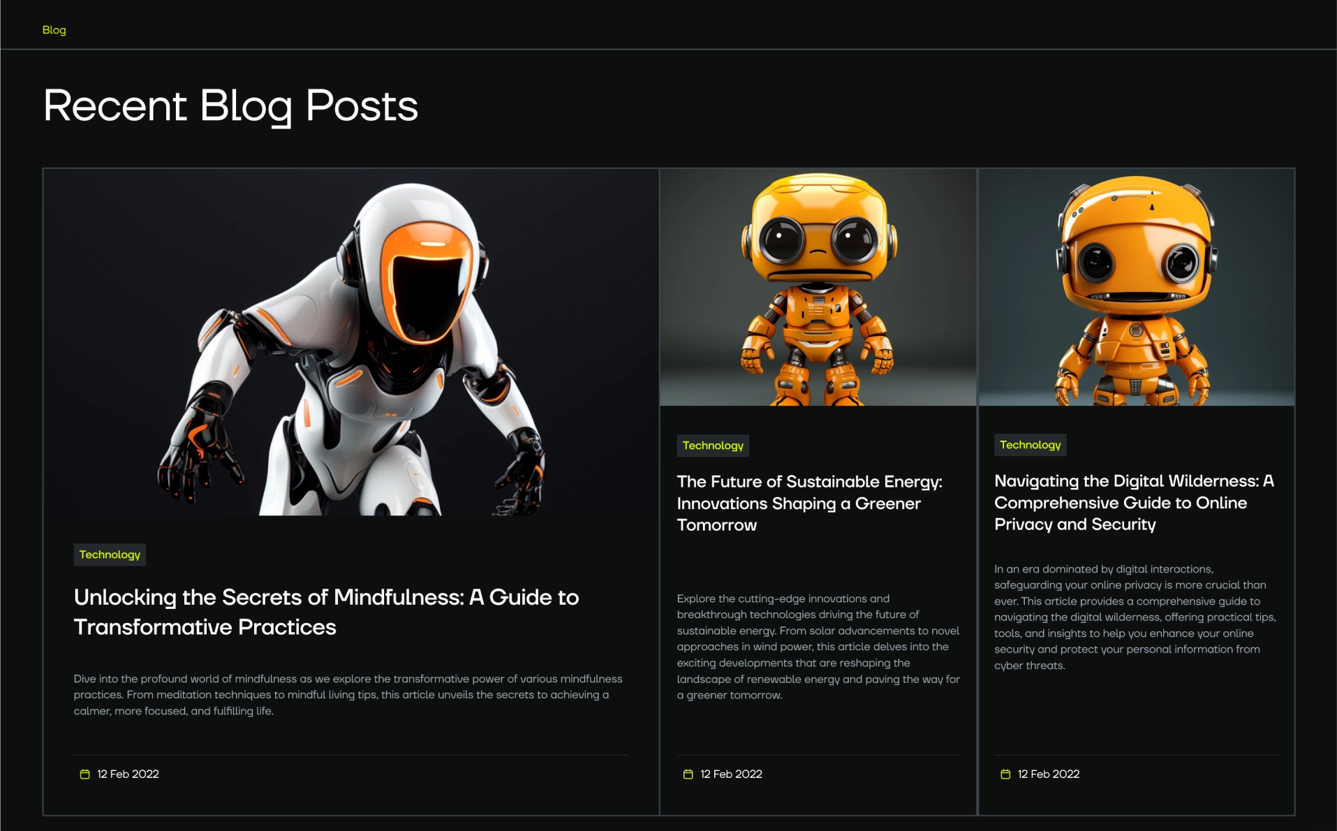
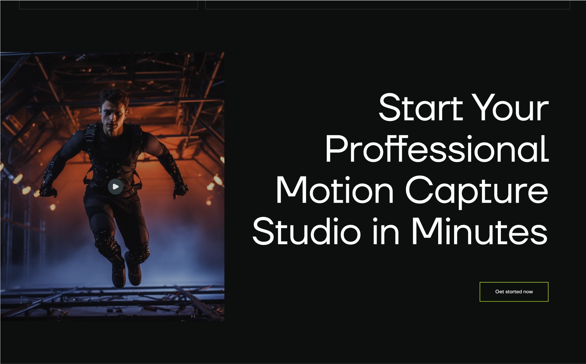
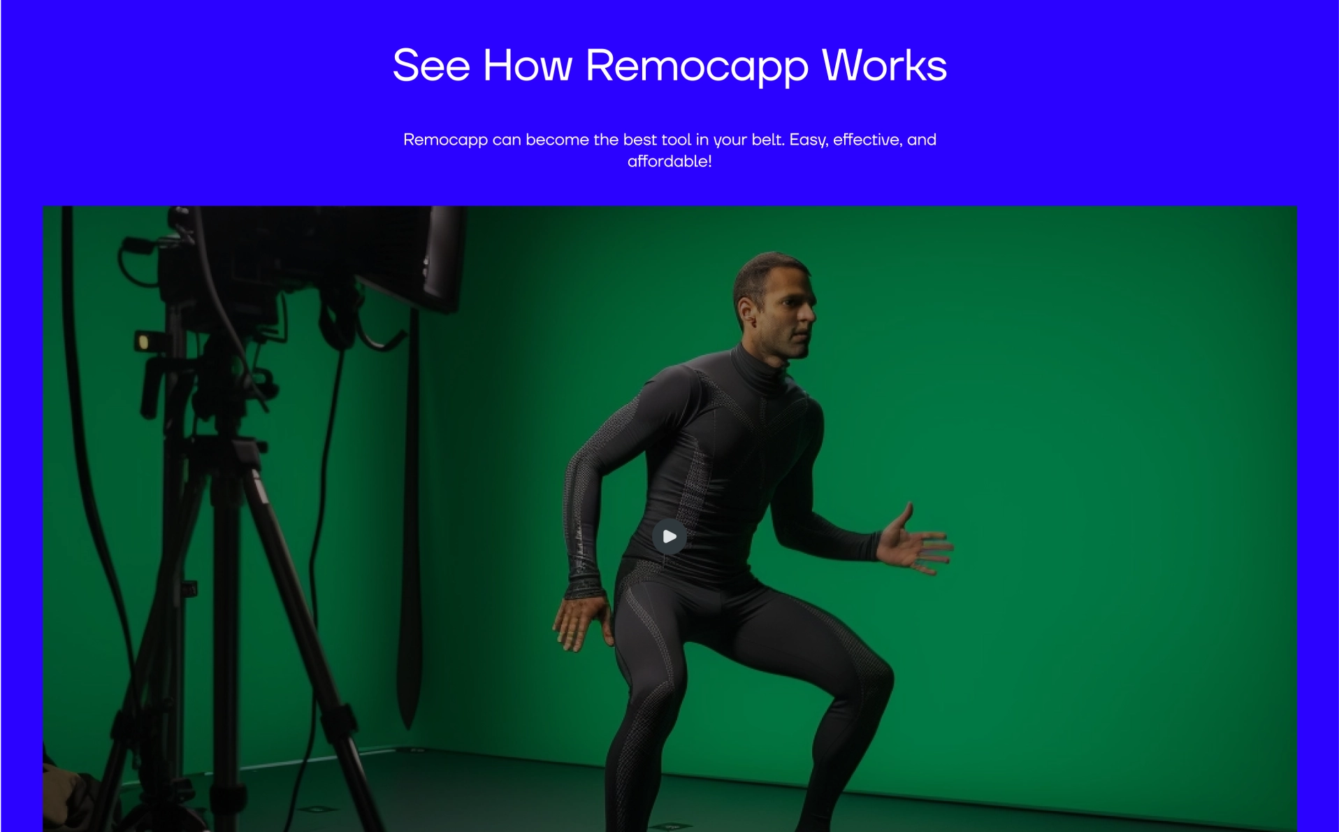
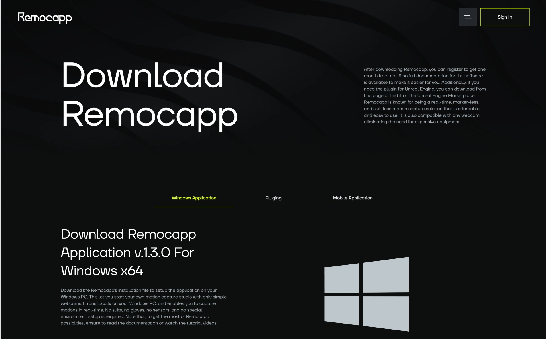
We adopted a new approach on the marketing pages of the website. Since the website is an AI film studio, with competitor analysis and our findings, we concluded that we needed to use a lot of images and videos. This fundamental change in the marketing pages includes numerous videos and images that effectively showcase the brand's features and capabilities to customers, persuading them to make purchases
In this timeline, we describe how our teams in various departments carry out their activities to create a fruitful process that leads to achieving the goal of redesigning this product.

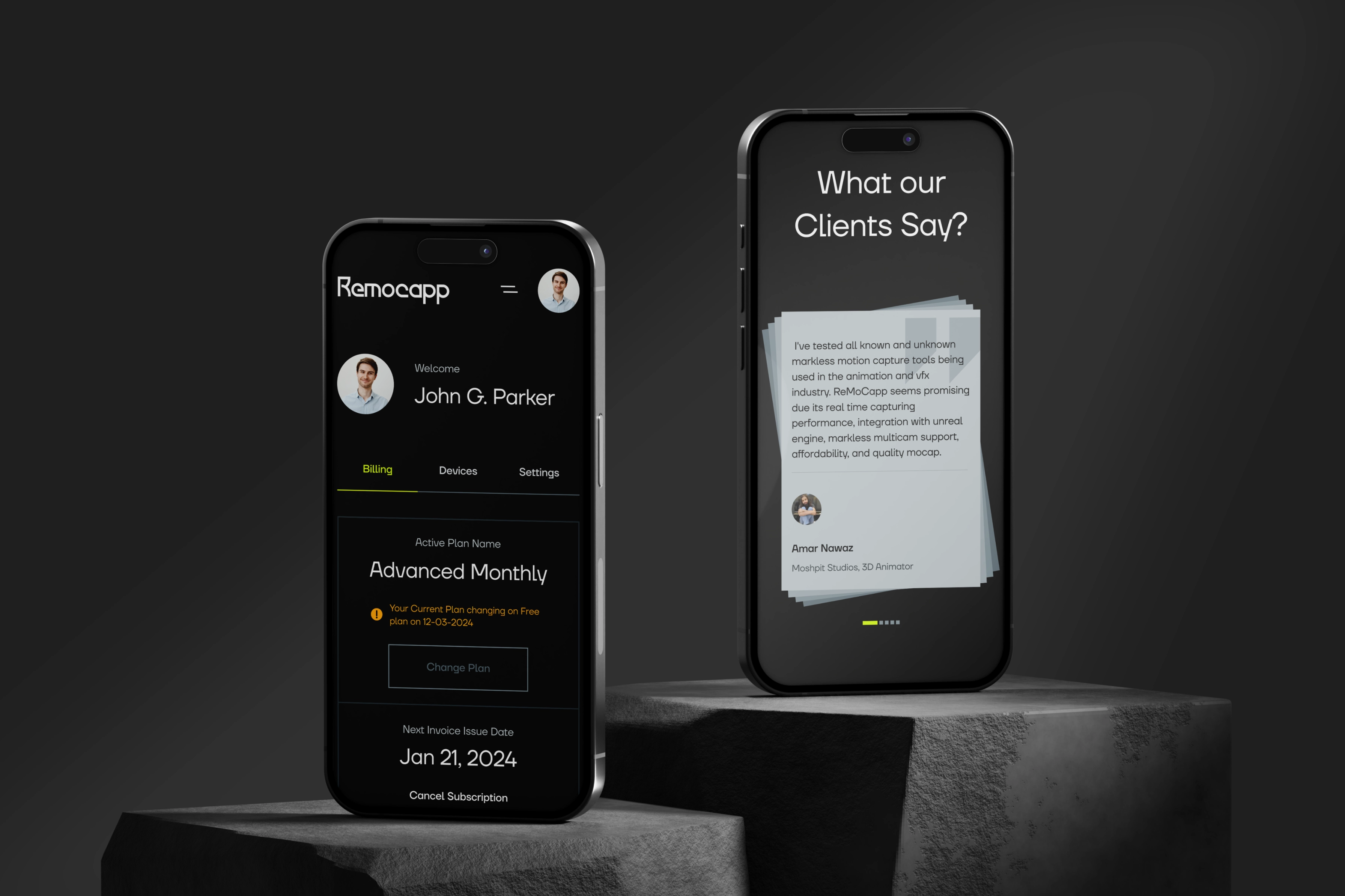
Remocapp is an innovative and up-to-date brand that offers unparalleled technology for the future of film and game studios worldwide.
However, this brand needed to be recognized with a modern and professional tone. It required using colors for symbolism that convey its boldness and modernity to users' minds. Therefore, we used a color with high contrast, a font with a geometric style that slightly invokes a sense of seriousness to the audience, and ultimately, helps the user create a professional Motion Capture.
This brand is now ready to gain its market share with this new identity and attract more customers to its product.
Other Project
- Let's Work Together. Let's Work Together.
- Let's Work Together. Let's Work Together.
- Let's Work Together. Let's Work Together.
- Let's Work Together. Let's Work Together.
