Discover the
job of your dreams!
job of your dreams!
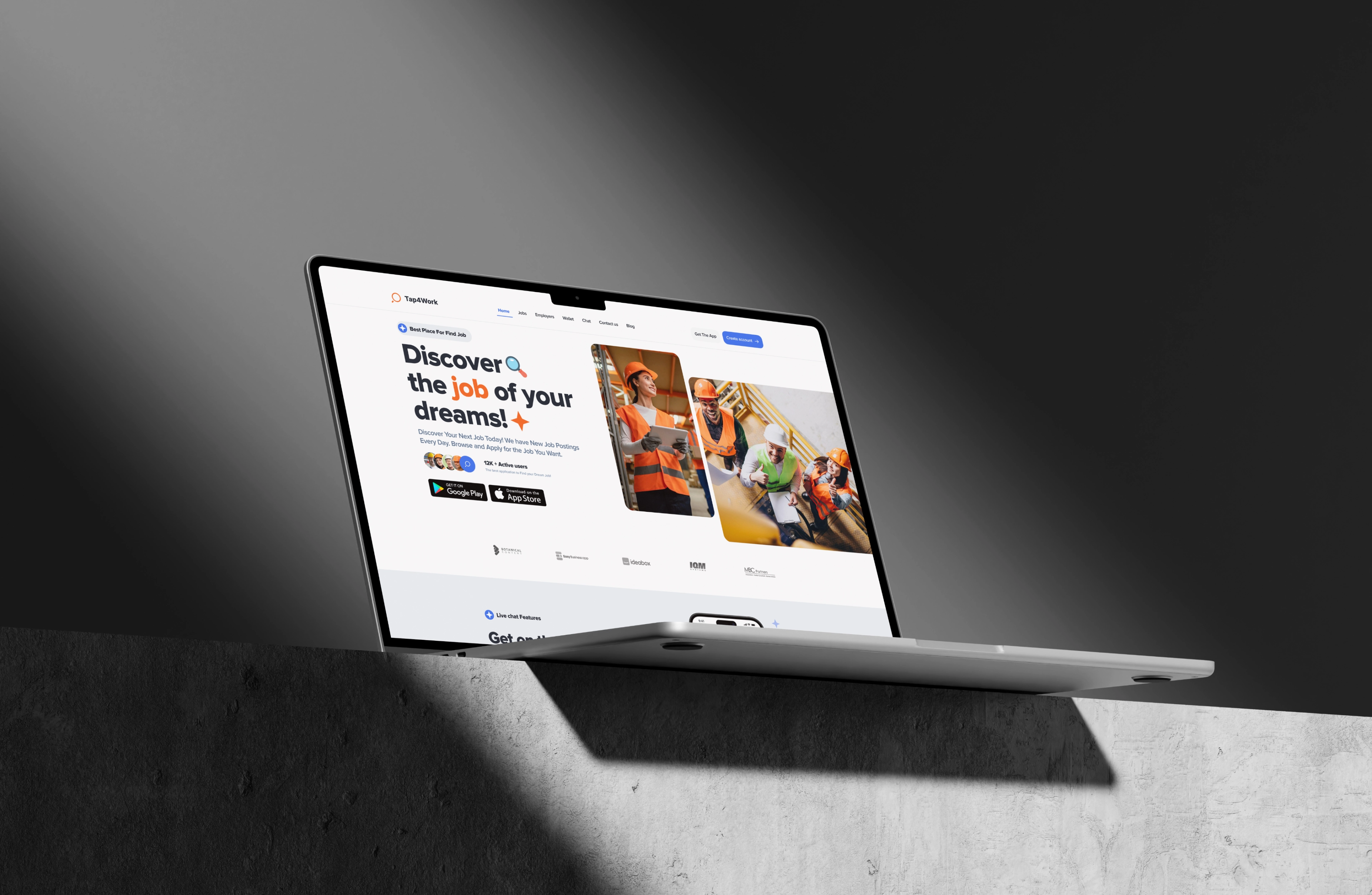
This project was truly extensive across various sections, including the marketing website, worker dashboard, employer dashboard, and mobile application, encompassing all its components and features. It was one of the largest projects undertaken at our design agency, and we are very pleased that we achieved a good outcome.
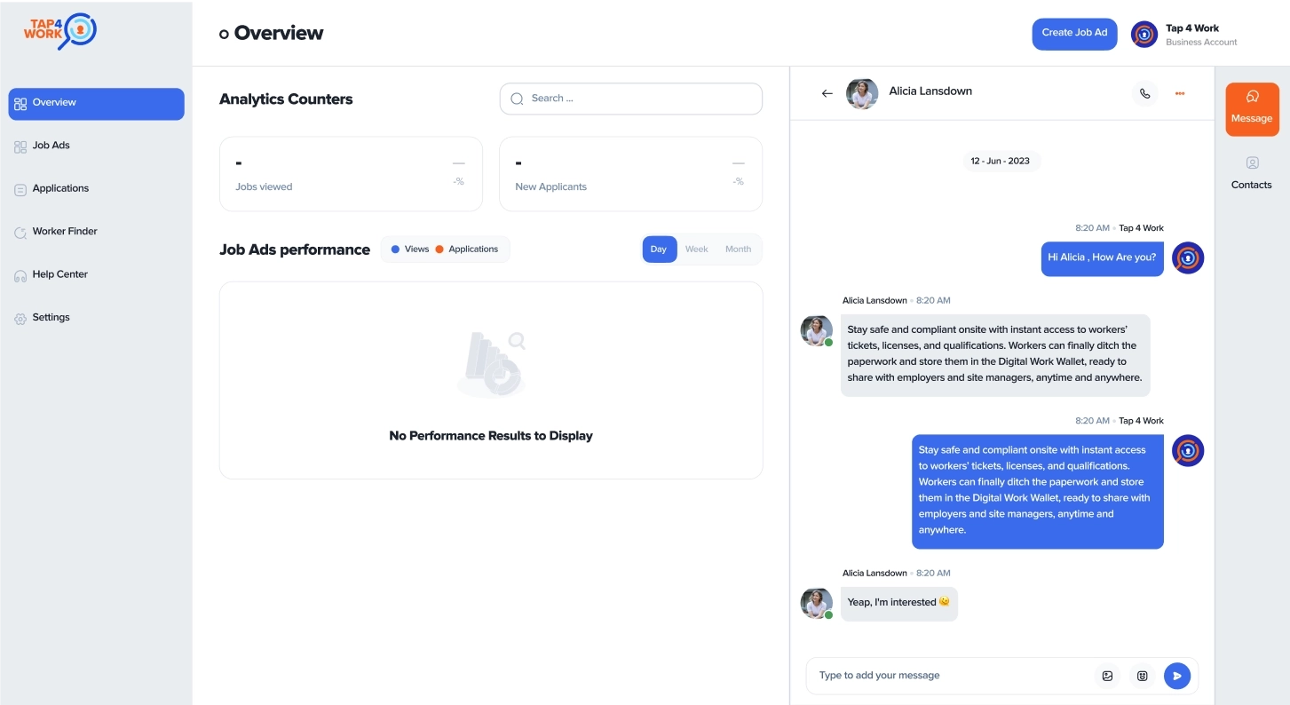
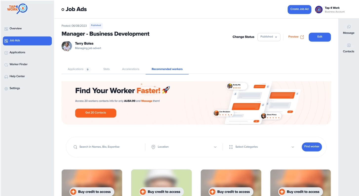
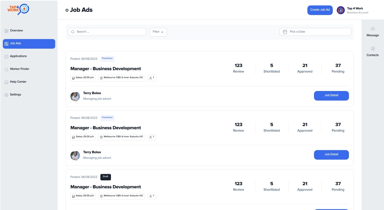
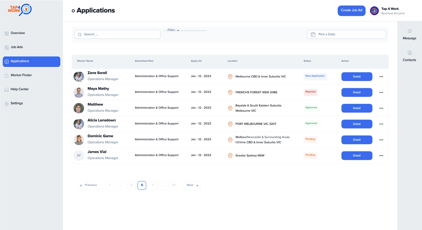
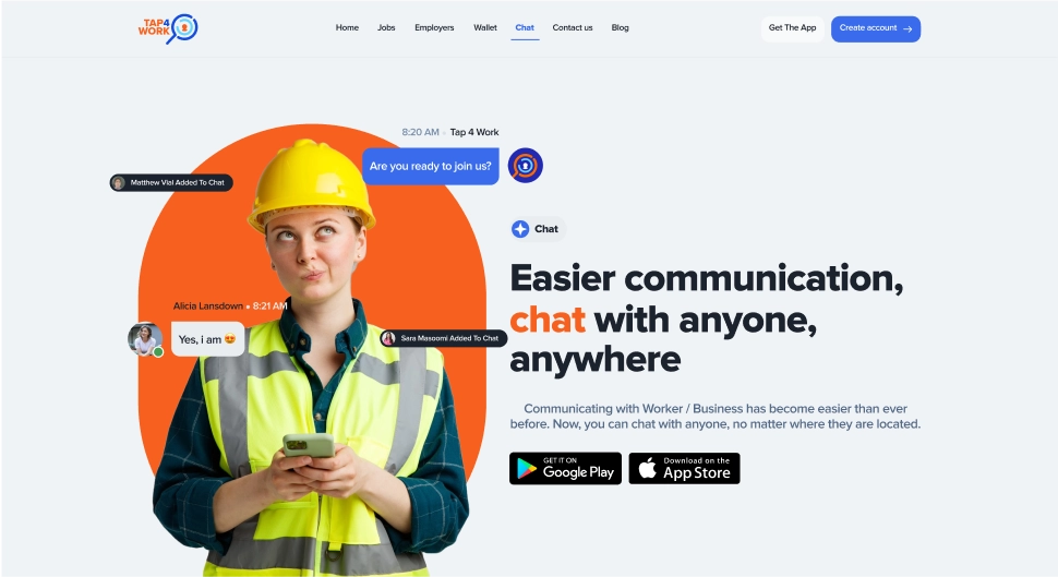
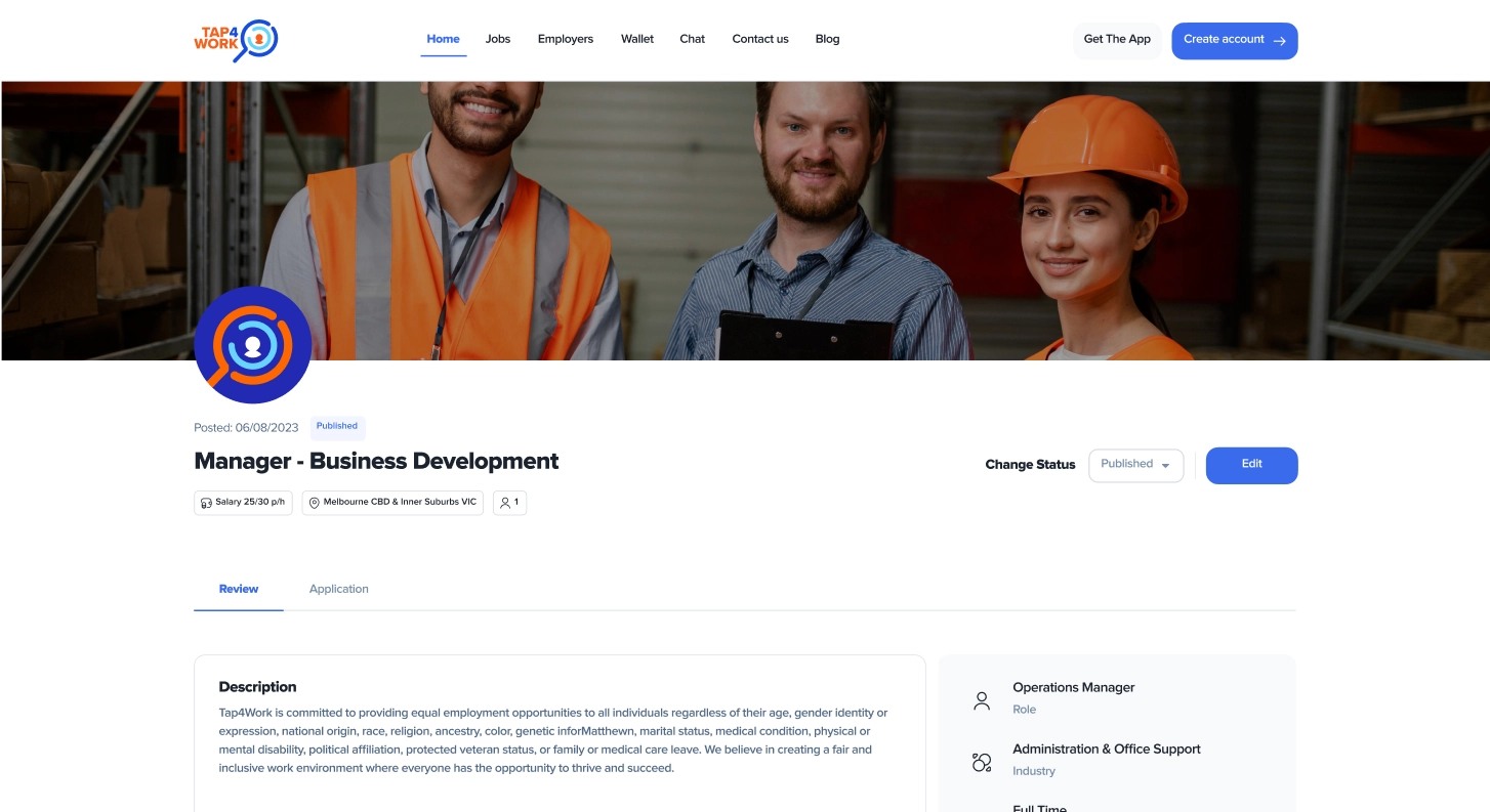
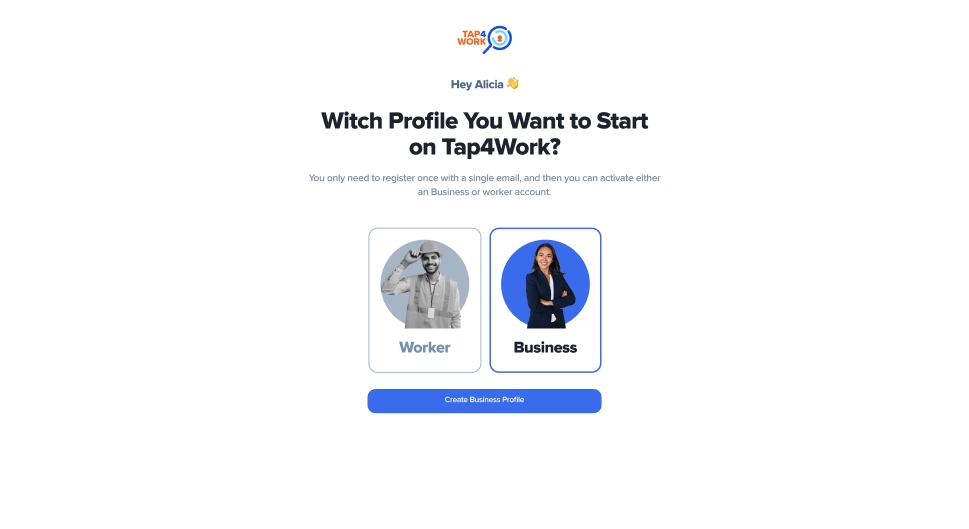
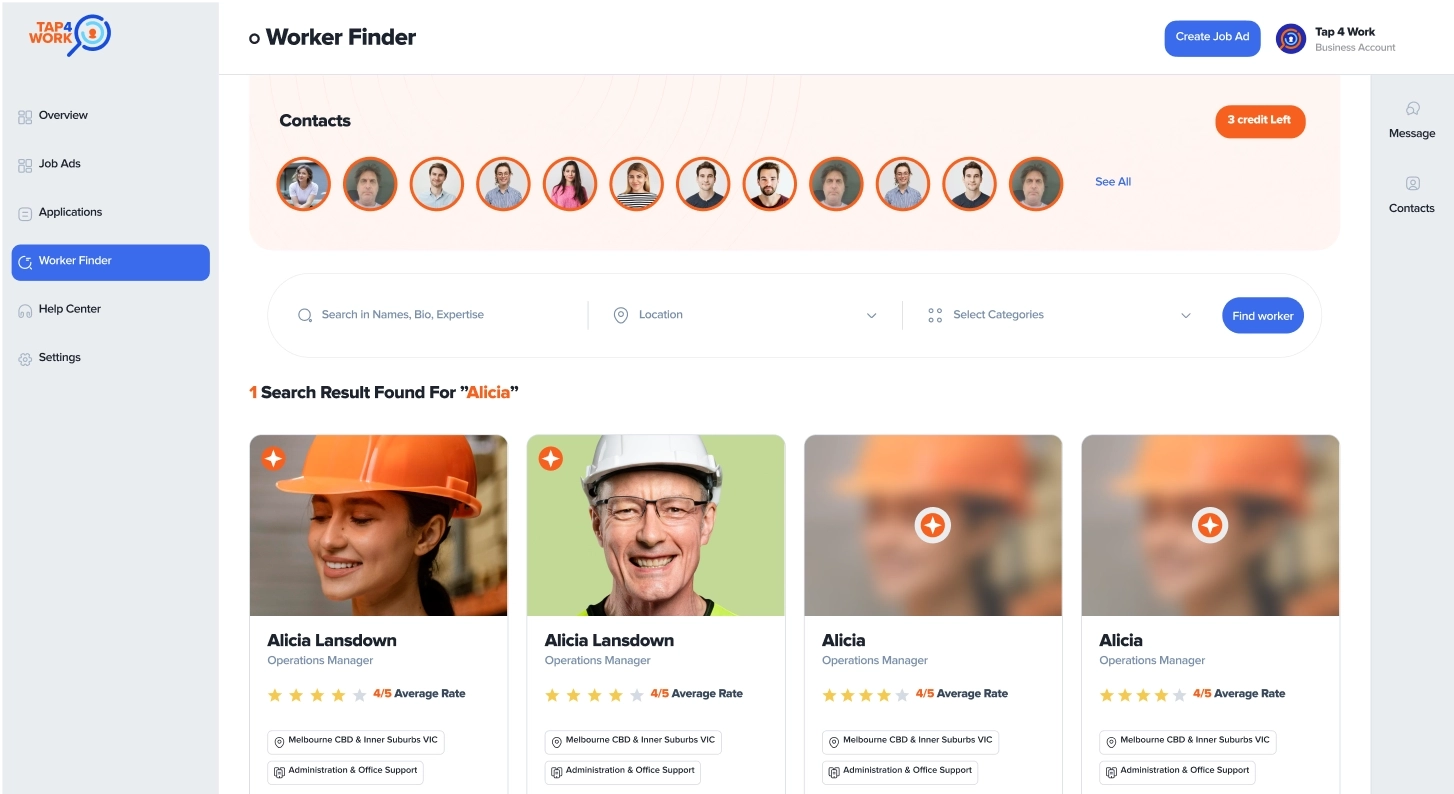
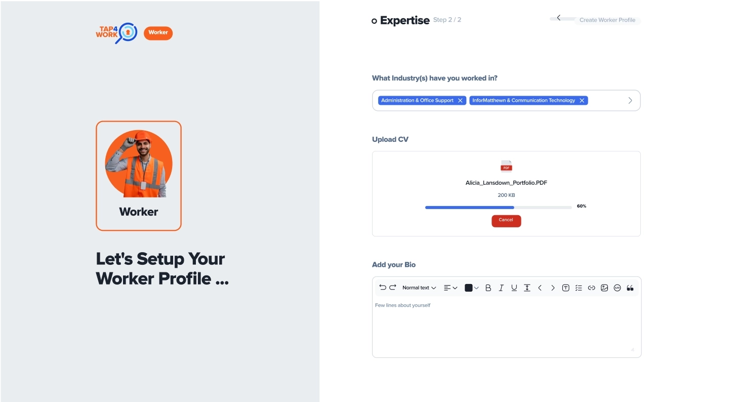
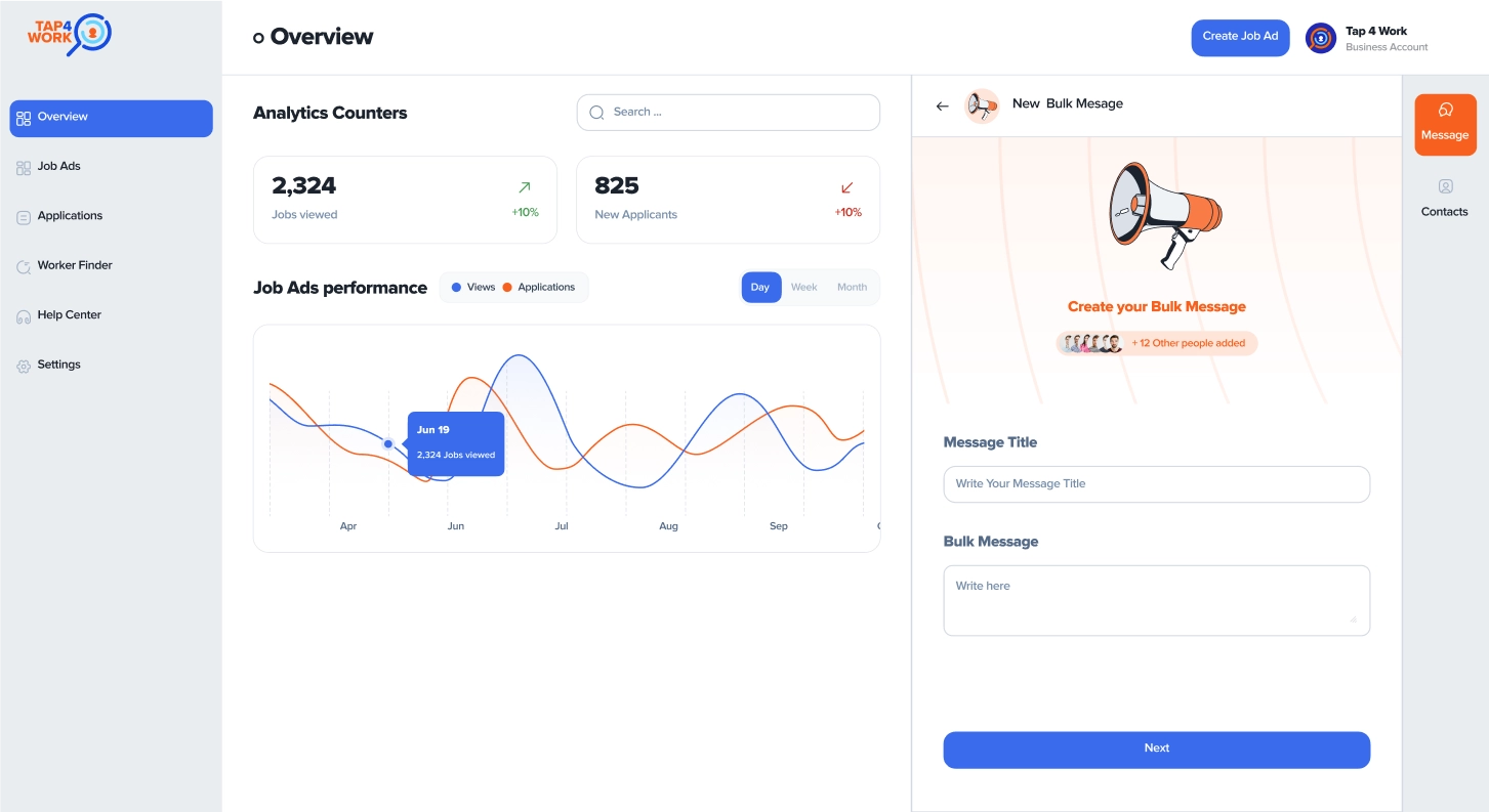
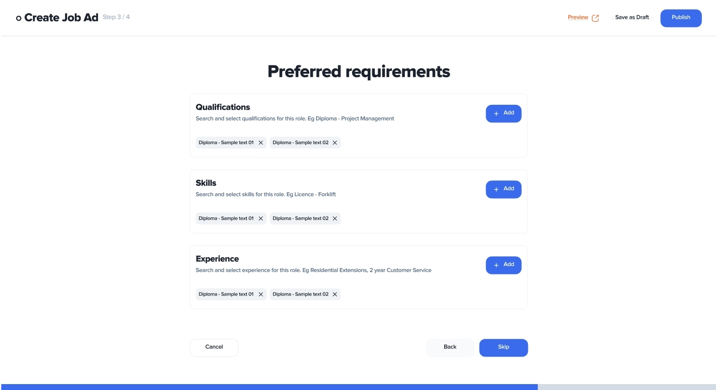
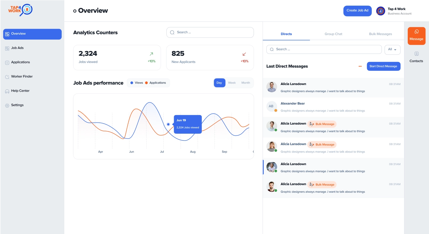
The initial user experience of this website was very confusing for users. Its information architecture was so complex that it felt like solving a 100-piece puzzle!
For example, there was not a clear and transparent distinction between the roles of workers and employers in the user experience, and at times, these roles were playing against each other instead of complementing each other.
What we did was fundamentally redefine the user roles in the system and create a clear and transparent path for users. We redesigned the information architecture and designed over a hundred different components to ensure that we anticipate all possible needs and scenarios that users might encounter while using the web
Old Shit Dashboard 💩
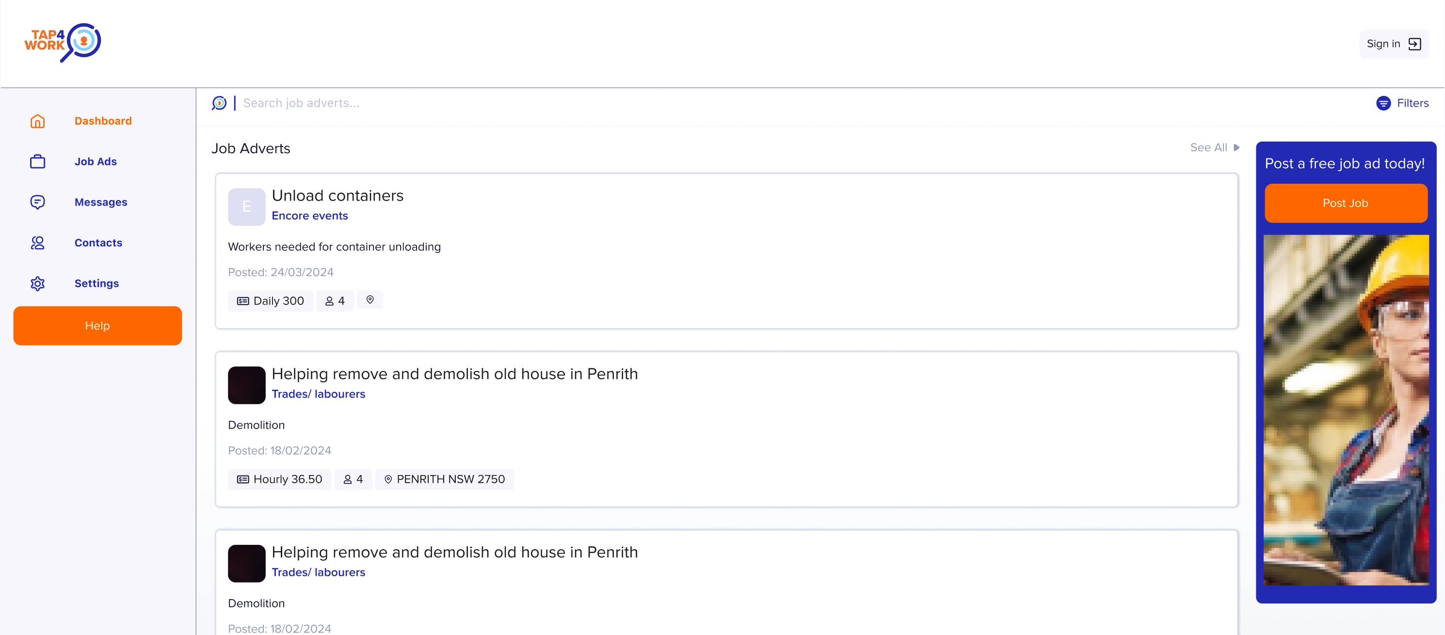
It was truly confusing and disorienting, making users feel lost. After struggling to understand, users had to sign in to use the website. Then they could define their role as either a worker or an employer and proceed with the website.
- Workers had to enter the dashboard to see job opportunities, which was an unconventional path for users expecting to find jobs on the marketing website.
- Allowing users to enter the dashboard without a default role and then create their role added heavy strain on the coding system and unnecessarily burdened users with decisions they didn't need to make. For instance, a user might just want to browse jobs and not engage in creating an employer account.
We first separated the user journey for creating worker or employer roles. This means you either enter the system as a worker or view your management dashboard as an employer. We brought job listings to the front page of the marketing website and even created dedicated pages for each job with custom search and filter options.
New User flow and Dashboard 💫
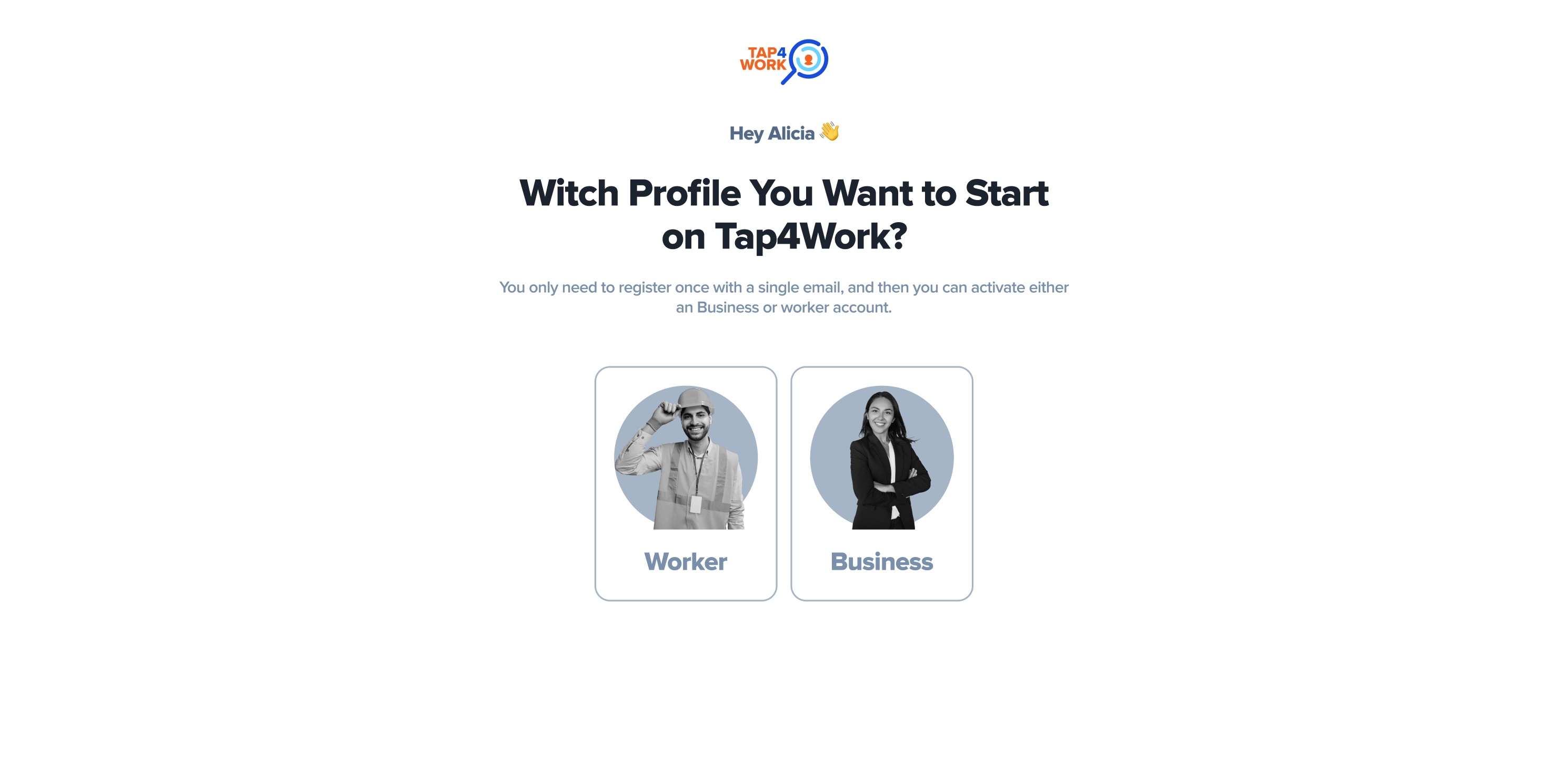
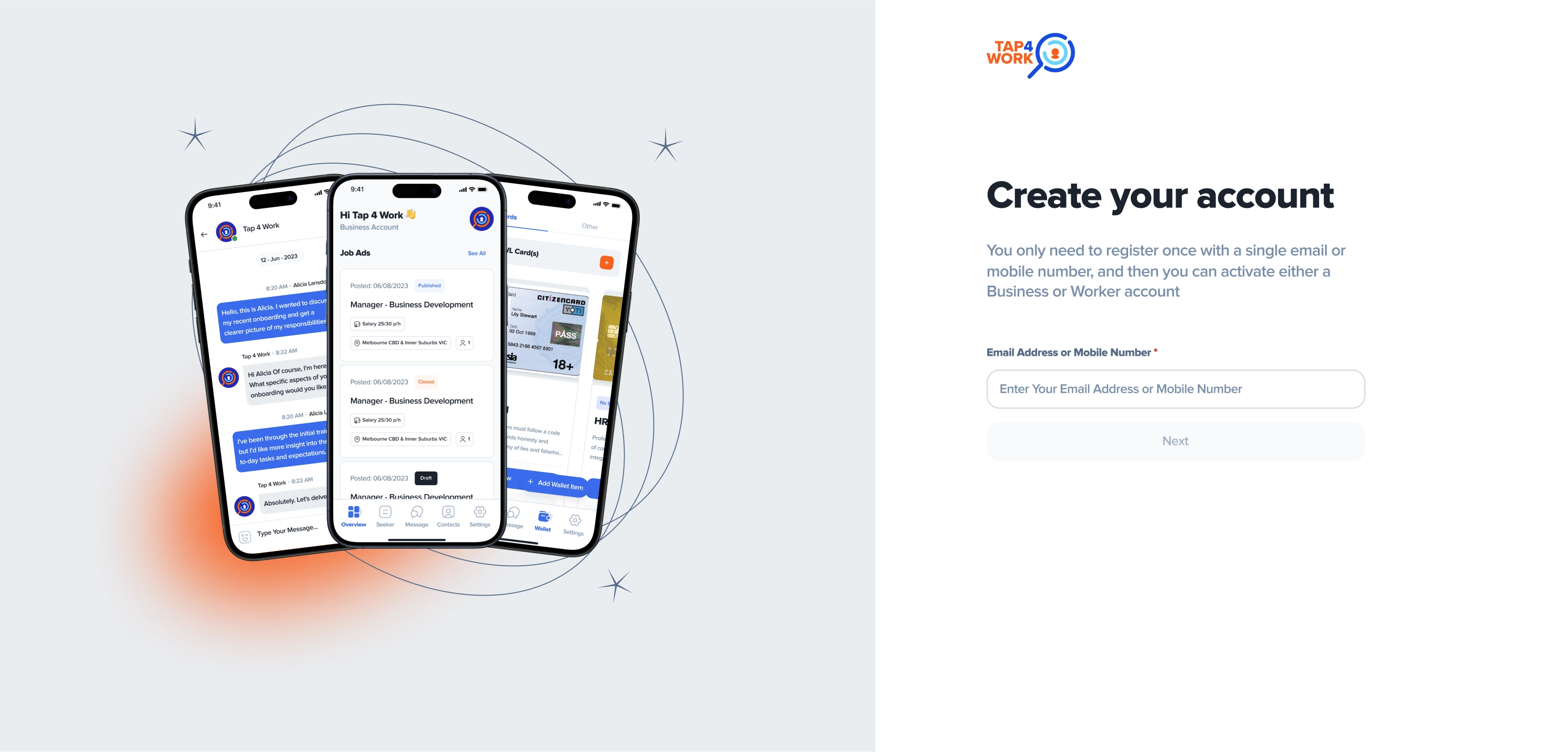
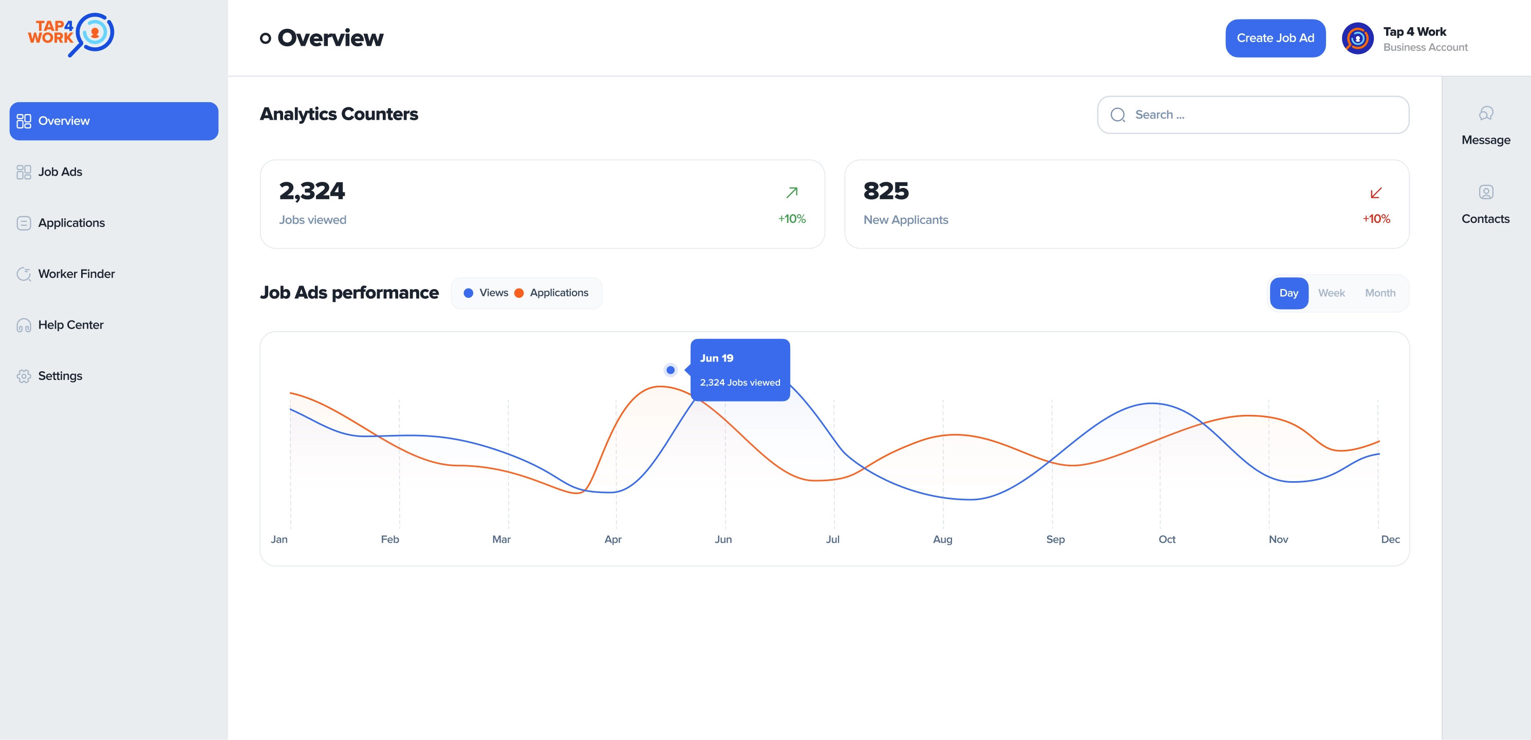
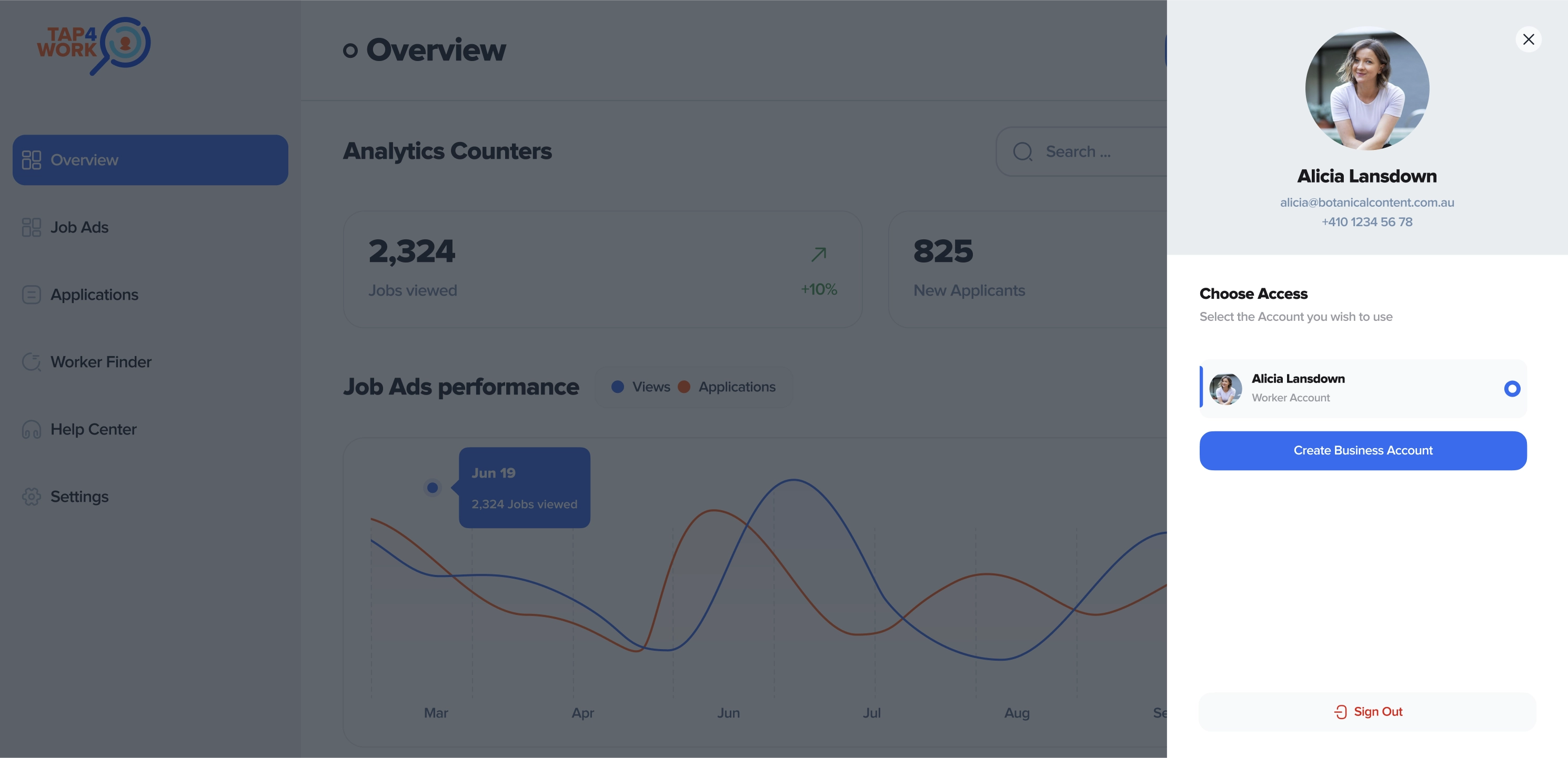
This means every element we designed aligns with atomic design thinking, and there's no scenario on the website for which we haven't defined a solution beforehand.
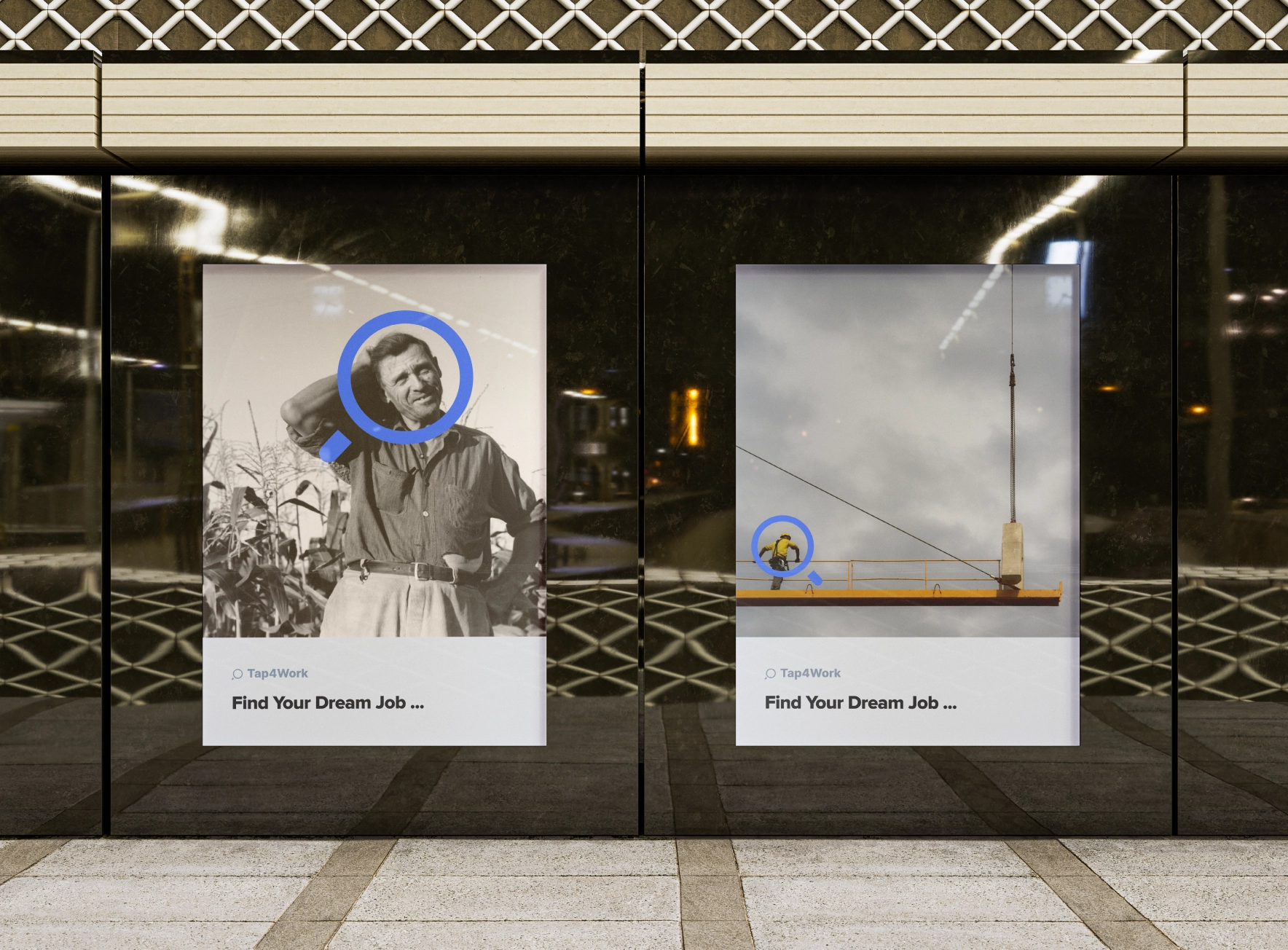
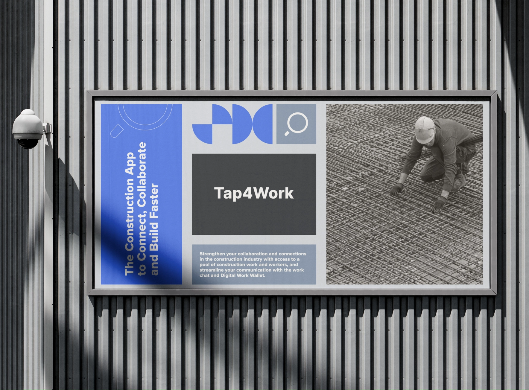
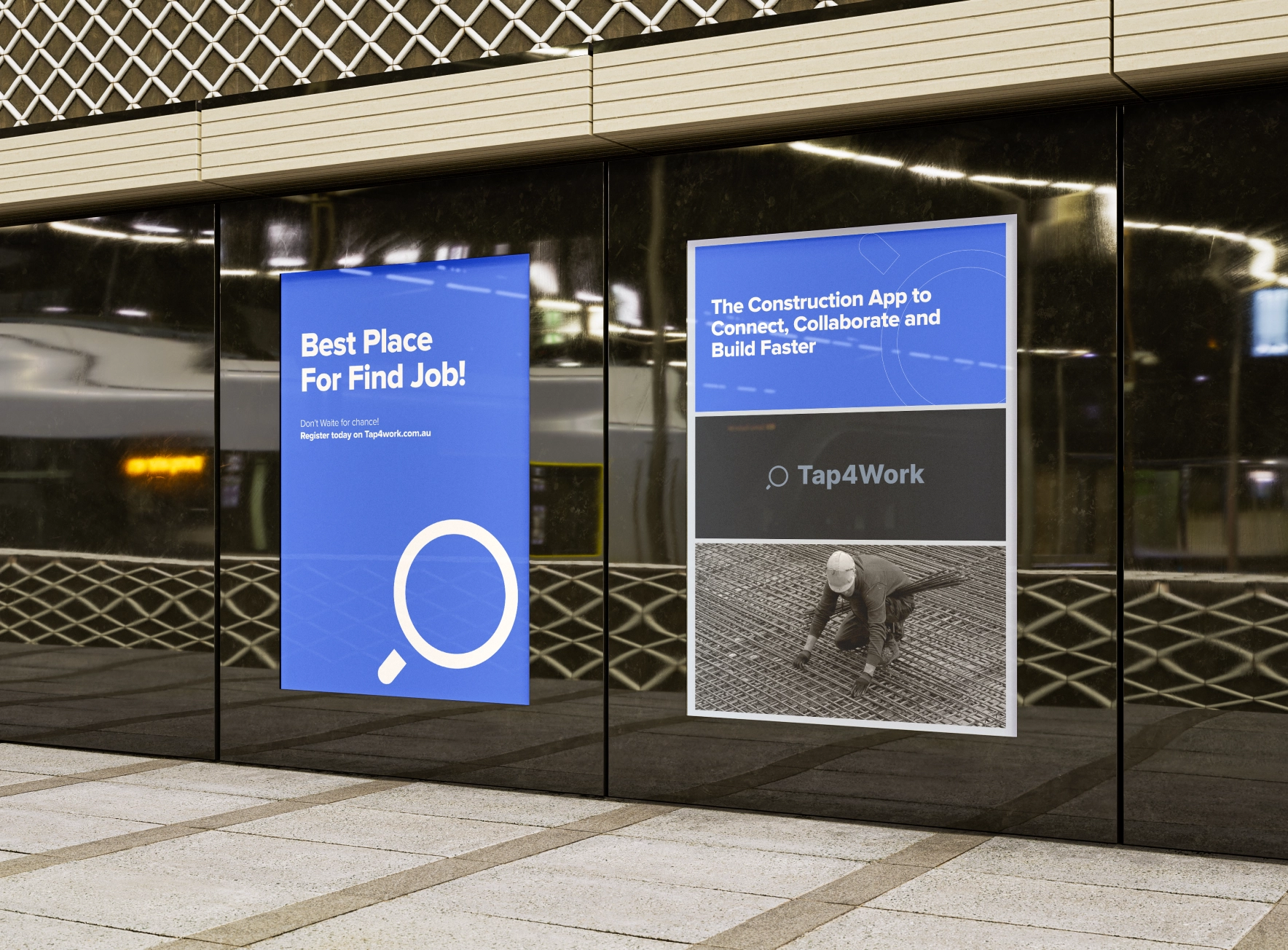
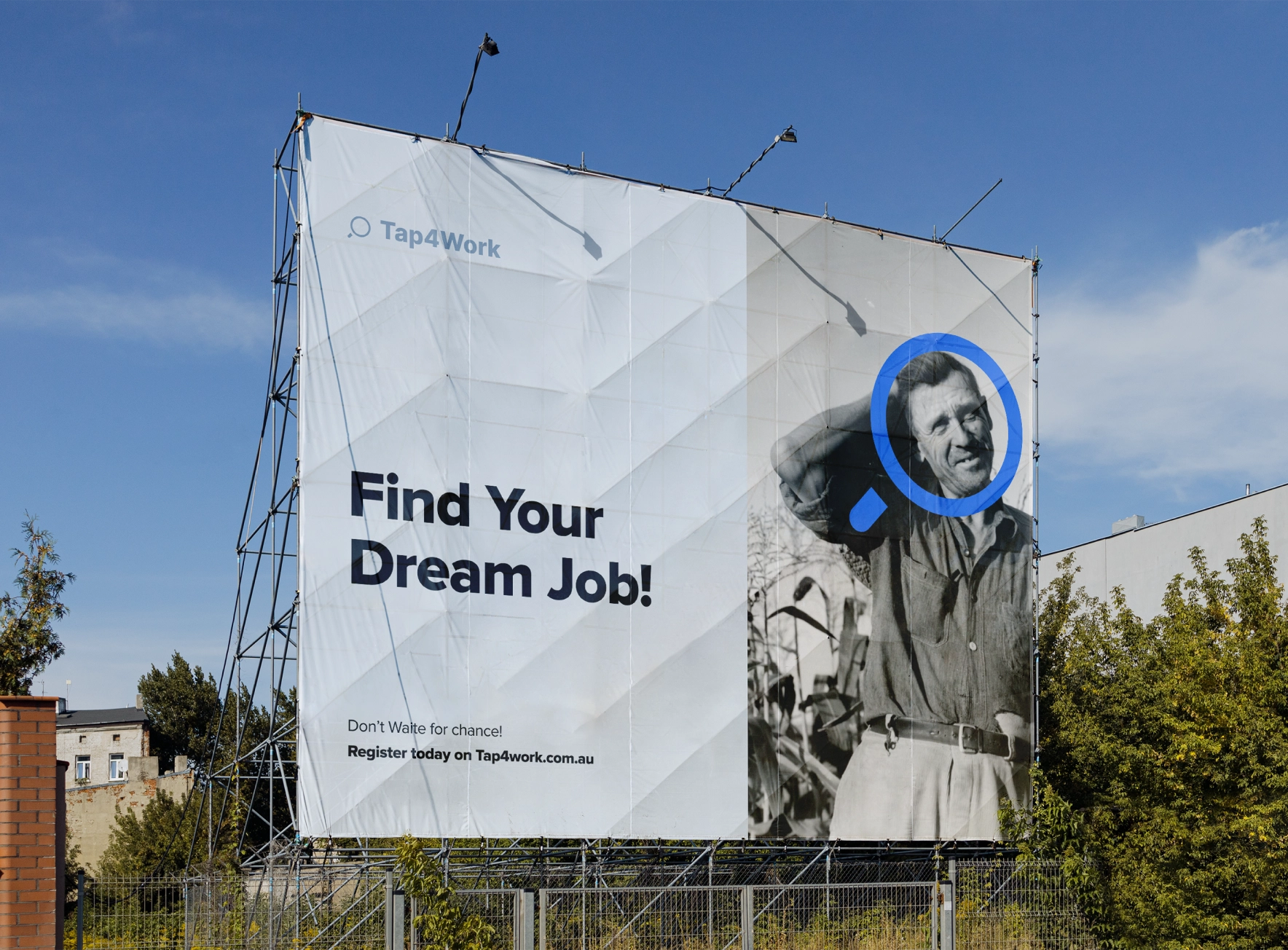
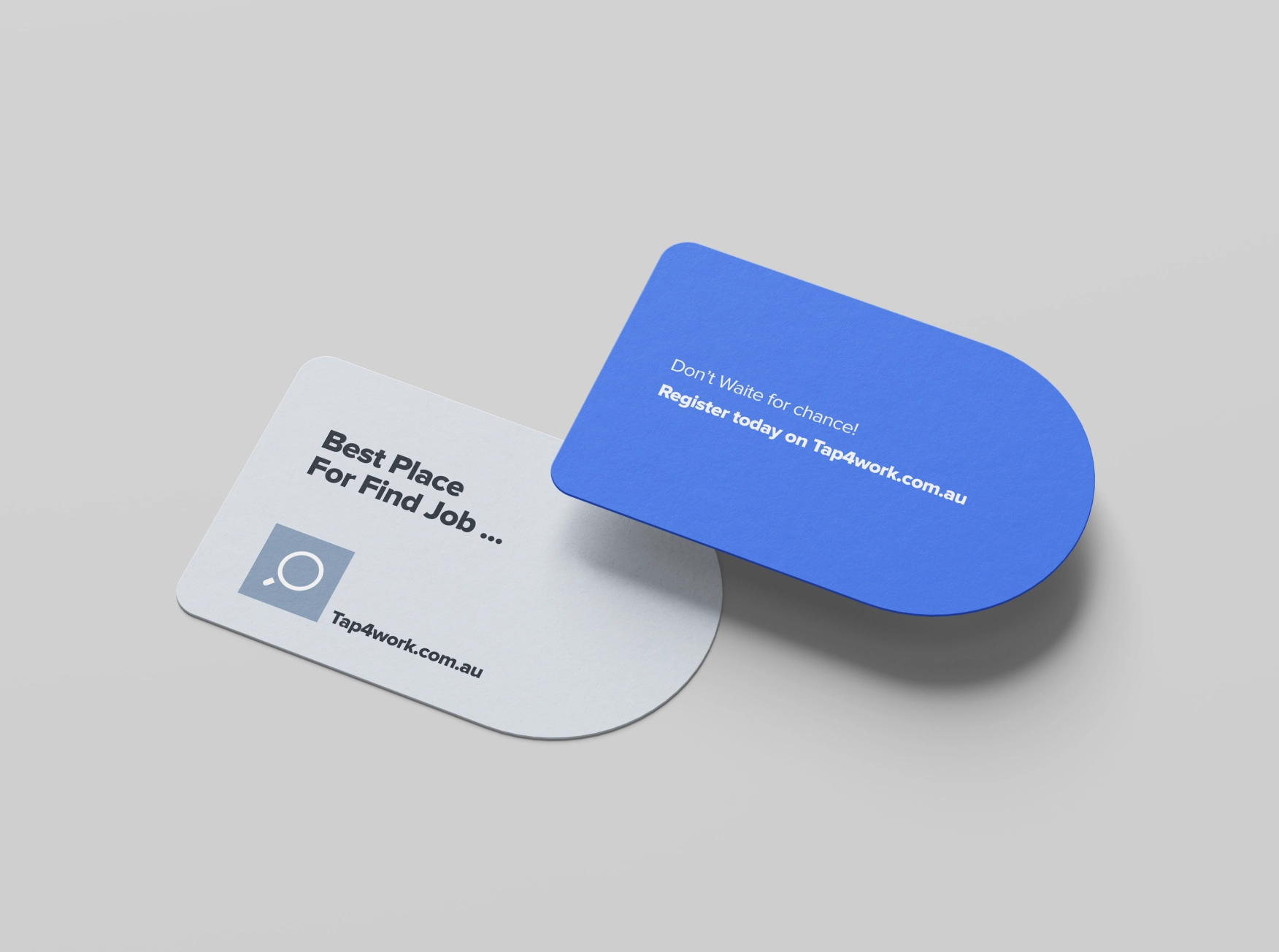
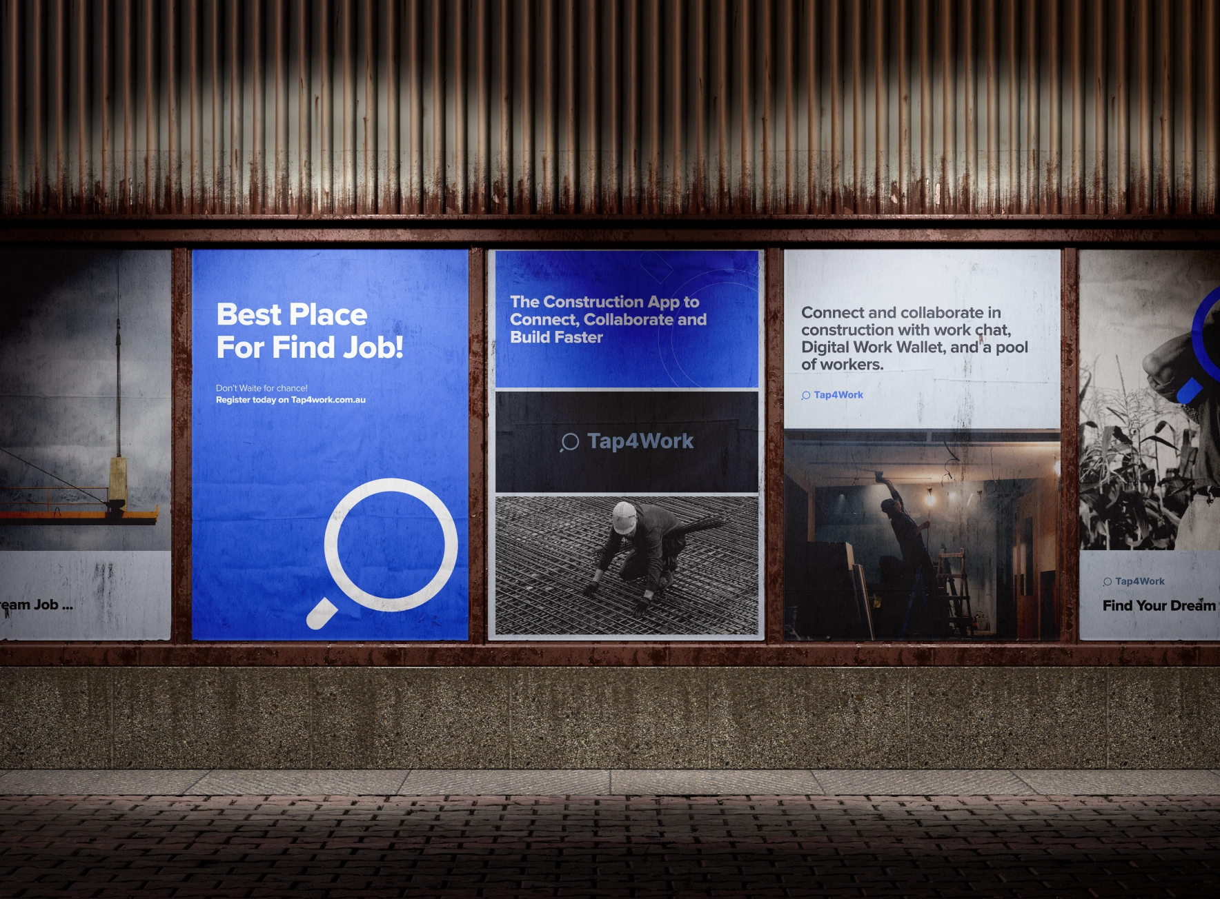
By redesigning user journeys, defining user experiences, and creating better user interfaces, we helped this system better serve Australian employers and workers in the construction industry collaborate more effectively!When everything is clearer and more transparent, we can expect more users to utilize this website and genuinely enjoy it.
Other Project
- Let's Work Together. Let's Work Together.
- Let's Work Together. Let's Work Together.
- Let's Work Together. Let's Work Together.
- Let's Work Together. Let's Work Together.